
Recent articles
© Dial Solutions Ltd 2009 - 2024
| AccordionAn accordion or concertina style interface can be created using the [Accordion:] tag. The [Accordion:] tag allows you to generate an accordion (or concertina) user interface consisting of a list of articles from elsewhere on your site. Only the first article is displayed at the outset, and the titles of the others are shown below the first article. Clicking on a title causes the first article to squeeze up to nothing and the new article is shown in full. The syntax for the Accordion tag is [Accordion:ArticleNumber,ArticleNumber,ArticleNumber]. There is no limit to the number of articles inside the accordion, but it doesn't make sense to have fewer than two! It is a good idea for the articles to be fairly short, otherwise the visual effect is lost if you cannot see the entire accordion on screen. The vertical space taken up by the accordion is sufficient to allow the longest article in the list to fit. Any shorter articles will be displayed with whitespace below them. The title bar of each article will display a tooltip containing the summary text for that article. You can set the summary to be hidden in any of the sub-articles and the summary will not be displayed when that segment expands, but the tooltip will still contain the summary text.For technical reasons, any tags in articles inside the accordion are disabled, though slide shows in the top level article (the one containing the accordion) will still run. The 'Accordion' below was generated using [Accordion:247,59,259] Storage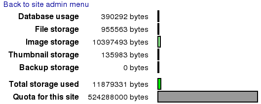 Clicking on the "Storage" link on the Site Admin page will take you to the Storage page. This page gives you a breakdown of how much of your allocated storage is being used. If you find that you are running out of space then the most effective way of freeing up space is by deleting out of date backups. If you are still short of space you can delete old articles that are no longer used. If you still require more space, you can contact us to arrange for a higher storage quota. Storage Clicking on the "Storage" link on the Site Admin page will take you to the Storage page. This page gives you a breakdown of how much of your allocated storage is being used.  Colour Picker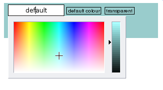 The colour picker window is displayed when a colour button is clicked and provides a consistent mechanism for choosing colours. It is only ever accessible to Site Administrators and Owners. There are 3 main parts to the colour picker window:
As you click in the coloured area or move the slider you will notice the value in the text field changing. Colours are represented as a # character followed by 3 pairs of hexadecimal numbers indicating the intensity of red, green and blue in the colour respectively, with 00 meaning no intensity and ff meaning full intensity. NB If the vertical slider is at the bottom (which it will be for black) clicking on the colour area won't do anything until you move the slider up. Sometimes you may need to be exact when specifying a colour and in this case you should type the colour number in manually. A good reference for colour numbers can be found at http://www.visibone.com/colorlab/big.html - just click on colours in the palette to find out their colour numbers. Colour Picker The colour picker window is displayed when a colour button is clicked and provides a consistent mechanism for choosing colours. It is only ever accessible to Site Administrators and Owners.  AutocompleteWhen entering text into single line entry fields, a menu of suggestions will pop up showing suggestions that start with the text typed in so far. 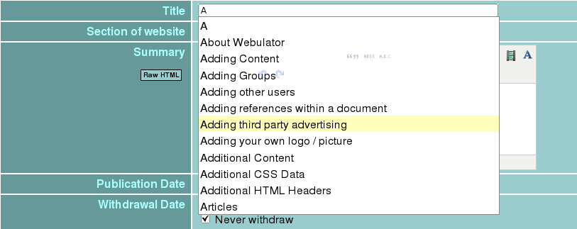 The menu will only contain entries from fields of the same type on the website being edited and that the particular user has the rights to read. To choose one of the suggested entries just click on it. Autocomplete When entering text into single line entry fields, a menu of suggestions will pop up showing suggestions that start with the text typed in so far. Accordion An accordion or concertina style interface can be created using the [Accordion:] tag. |


